Zoe Folts Therapy
How I took a therapist’s dated website from research to redesign: five interviews, four competitors, nine insights, and a new site that puts booking one tap away.
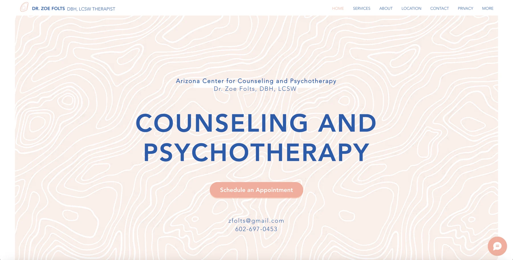
The old site
DiscoveryGreat therapist, tired website
Zoe Folts is a local therapist with more than 20 years of experience. Her site, zoefolts.com, had all the right information, but it was built like it was from another decade: a dark maroon frame, a stock compass banner, and a sidebar of ten-plus links where booking was just one item in the list.
My task was a full redesign with one hard rule: keep her content. So the work was all structure and visual design: reorganize what she already had so it felt calm, clear and easy to act on.
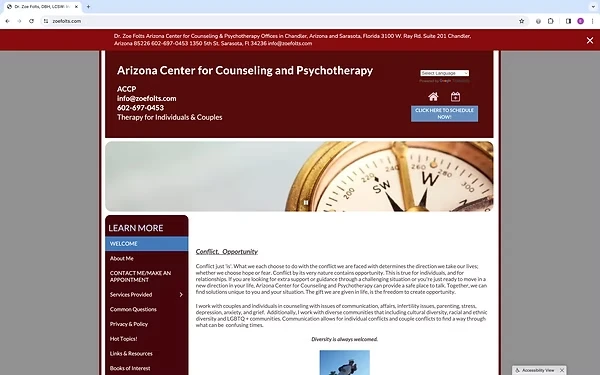
The original zoefolts.com: dark maroon framing, a stock banner, and ten-plus sidebar links with booking buried among them.
The proposal: make the site more inviting, easier to navigate and true to Zoe’s therapeutic approach, so that booking a free consultation is the easiest thing to do from anywhere.
What people need
ResearchCompetitor analysis
I compared four therapy practice sites side by side: each one’s value proposition, strengths, weaknesses and what they all had in common. With therapy, the site and the person are hard to separate, so I looked past layout at how well each one conveyed the therapist herself.
Branding matters
The strongest sites felt like one voice: color, wording, logo and photos all working together.
Simplicity is key
Easy booking from any page, and a clear focus on the therapist’s top three priorities.
Personal connection
Sites with a photo and a sense of the therapist’s personality felt far more trustworthy.
Showing care
Free resources signaled real concern for people’s mental health, beyond selling a service.
User interviews
I interviewed five people who have been in therapy about how they found and booked their therapist, and whether a website played a part. Three quotes stuck with me:
“I went to her website and just called her immediately, just because that seemed easiest.”
“I like to see a picture of them before booking an appointment so I can see who I’m speaking to.”
“A website is important to me, it shows they can keep up with the times and are aware of today’s world.”
Affinity mapping
I sorted everything from the interviews into pain points, features to include and shared trends. Nine insights came out of it, and they shaped every decision that followed.
Specific reasons
People start therapy for a specific reason, so the site should speak to targeted needs.
Approach matters
Users want to know the therapist’s methods and style.
Same-gender preference
Many prefer a therapist of the same gender for comfort.
Too much info
Information overload caused confusion. Keep it clear and concise.
Matching vibe
The site should feel like the therapist’s personality.
Show her face
Most people want to see a photo before they book.
Booking first
Booking a session should be the main, easiest action.
Insurance up front
People want to know right away if insurance is accepted.
Phone calls win
Many prefer to book the first appointment with a call and hear the therapist’s voice.
User persona
From the interviews and affinity map I built Chrissy, the person this redesign had to work for.
Just moved for a demanding new job, has great insurance and no community yet. A friend suggested she find a therapist.
- A good-fit therapist nearby who also does video sessions
- A woman therapist whose personality she can get a feel for online
- Someone who takes her insurance
- Gave up last time because sites didn’t say if they took insurance
- Called a therapist who never called back, and there was no way to book online
- Has a hard time trusting people and wants to know she’ll click first
Goals & priorities
DefineLining up the goals
Before designing anything, I mapped Zoe’s business goals, users’ goals and technical considerations to find what all three shared.
Attract people looking for a good fit, show Zoe’s personality and style, get them to book or call.
Find a matching therapist, see who she is, book easily, and find a phone number and email fast.
Organized and user-friendly, a photo of the therapist, booking and contact on every page.
Book a session, get to know each other a bit first, and a site that’s easy to use.
Feature priorities
Because this was a redesign, the priorities mostly stayed the same. The one big call was to de-prioritize Zoe’s long list of outside links: it mattered to her, but research showed it wasn’t what people came for, so it moved behind the menu.
User flows
Everything on the site funnels to two actions: book a free consultation or contact Zoe. Since the links were moving behind the menu, I mapped two ways to reach them and planned to test both.
Sketch to screen
DesignLow-fi to hi-fi
I started with quick paper sketches of the homepage, services, about, location and contact screens. The homepage held everything, with consultation and contact up top and a hamburger menu for individual sections.
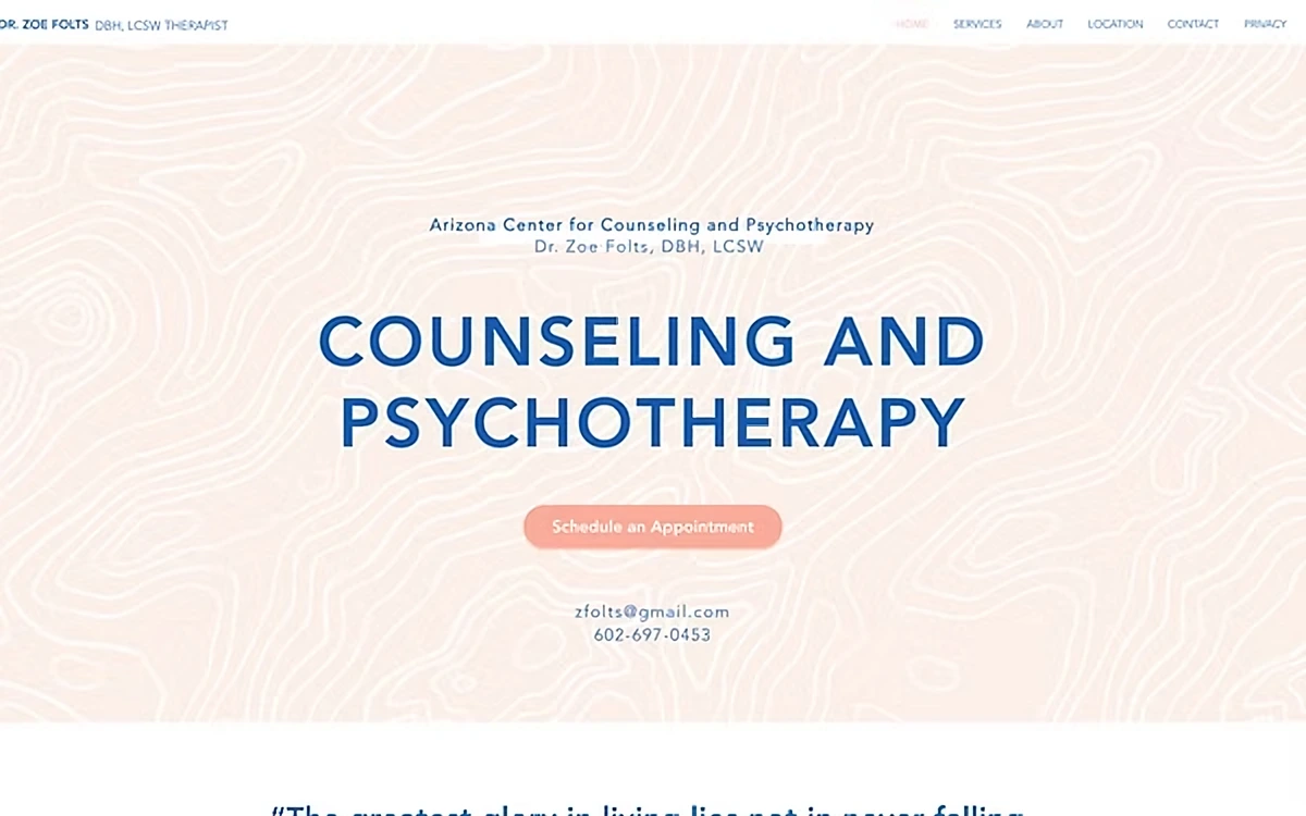
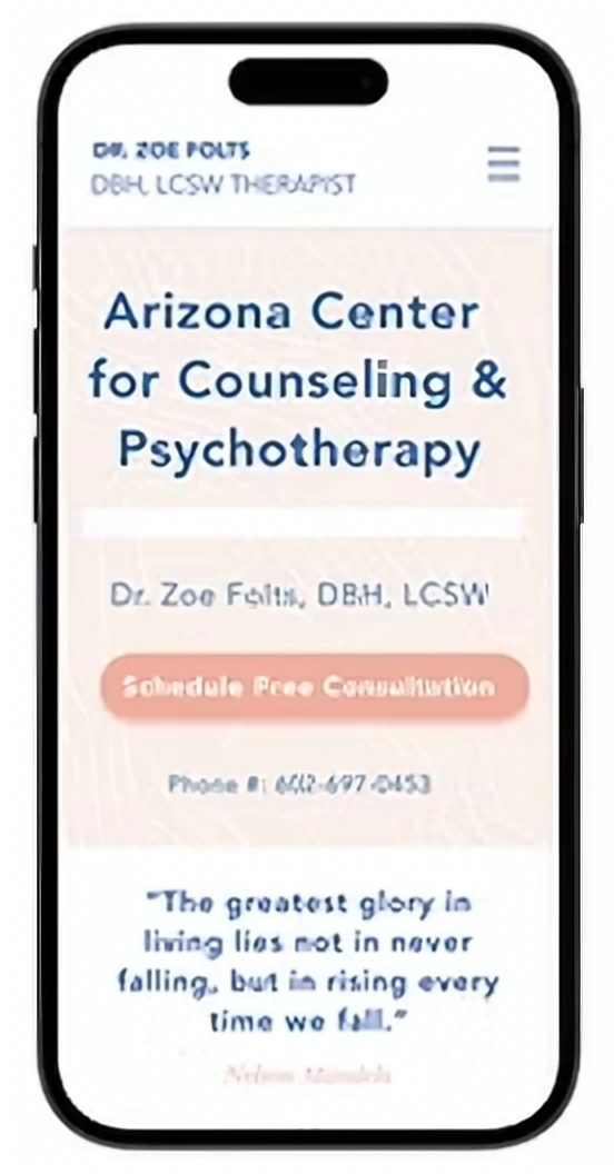
Early testers found the flow intuitive and enjoyable, so I moved into high-fidelity frames in Figma: a soft peach-and-navy palette, a calm topographic texture, Zoe’s photo front and center, and her own words broken into easy pieces.
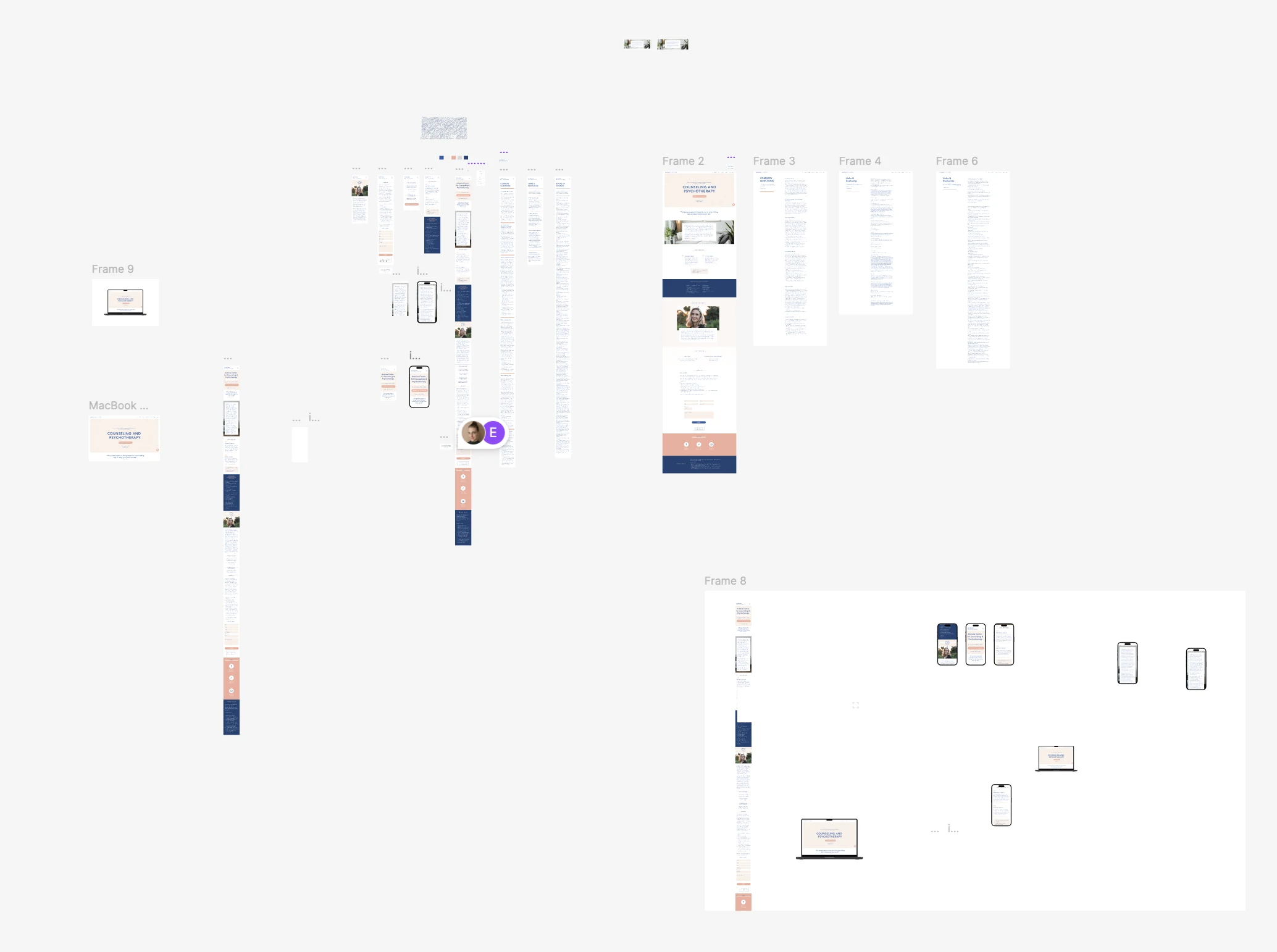
The final design
Test & refine
User testingTwo tasks, five testers
Every tester got through both tasks easily. The feedback was about comfort, not confusion: one tester found the site wordy, and scrolling one long page felt clunky on a phone.
“Schedule a free consultation with Zoe, then go back to the home page.”
Tests the booking feature and getting back home.
“There are two ways to get to links and resources. Can you find both?”
Tests whether both paths in the navigation make sense.
What I changed
Two iterations came straight out of testing.
Mobile structure
On laptop, one long homepage with jump links works fine. On a phone it felt cumbersome, so I kept a complete homepage and moved each section to its own page behind the hamburger menu.
Shorter reads
A tester found the paragraphs long, so I split them into smaller, digestible pieces and added design elements between them.
“Seeing my client derive joy from the end result was truly rewarding.”
Redesigning someone else’s site is different from inventing an app from scratch: the job is to bring their vision to life, not mine. Working closely with a therapist deepened my appreciation for collaborative design, where turning someone’s vision into a real digital experience makes a meaningful difference.